Colour Theory Science
3 Simple Colour Tricks to Control Mood in Your Colouring
By Peace on Paper August 15, 2025
Colour is not just decoration. It nudges how we feel and where we look. You can use that to your advantage. Warm hues tend to feel lively and close. Cool hues tend to feel calm and a little distant. Lightness and saturation matter as well. Softer, lower contrast palettes feel gentler than bold, high contrast ones.
Colour affects us through perception and learned associations. We often read warm colours as active and attention grabbing. We often read cool colours as calming and spacious. Bright, highly saturated colours lift arousal. Muted, low saturation colours feel quieter. These effects vary by culture and context, so use them as guides rather than rules.
Three ideas to keep in mind:
You shape mood with three simple adjustments. Hue, value and saturation. Think of hue as the family, red or blue, value as light to dark, and saturation as greyed to vivid. Each lever shifts feeling in a slightly different way.
Hue sets the basic emotional direction. Warm families often feel sociable and immediate. Cool families often feel steady and spacious. Value sets contrast, which is how much things jump out from the page. High contrast feels punchy. Low contrast feels soft. Saturation sets intensity. Greyed colours sit back politely. Vivid colours ask for attention.
If you only change one lever, start with value. A softer value range will calm even bright hues. A wider value range will add drama even with cool colours.
Here are three pencil-based colour tricks you can use right away to control mood in your colouring. Each uses real colours from common sets, so you can match them exactly.
Want instant palette suggestions? Try our Mood Colour Selector tool - describe any feeling like “cosy autumn evening” or “energetic summer day” and get matched pencil colours from top brands.
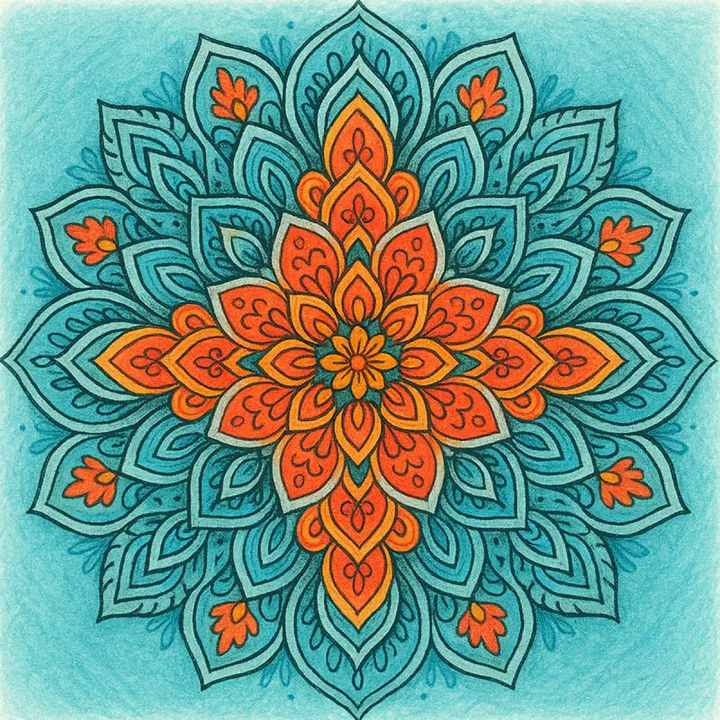
Use cool blues and greens with moderate saturation. Keep contrast gentle.
Why it works: Cool hues tend to recede and reduce visual tension. Medium values avoid harsh contrast, which keeps the page restful and perfect for evening colouring sessions.
Try it: Keep your darkest pencil for a tiny anchor in the focal area. Shade most other areas a step lighter than you think you need.
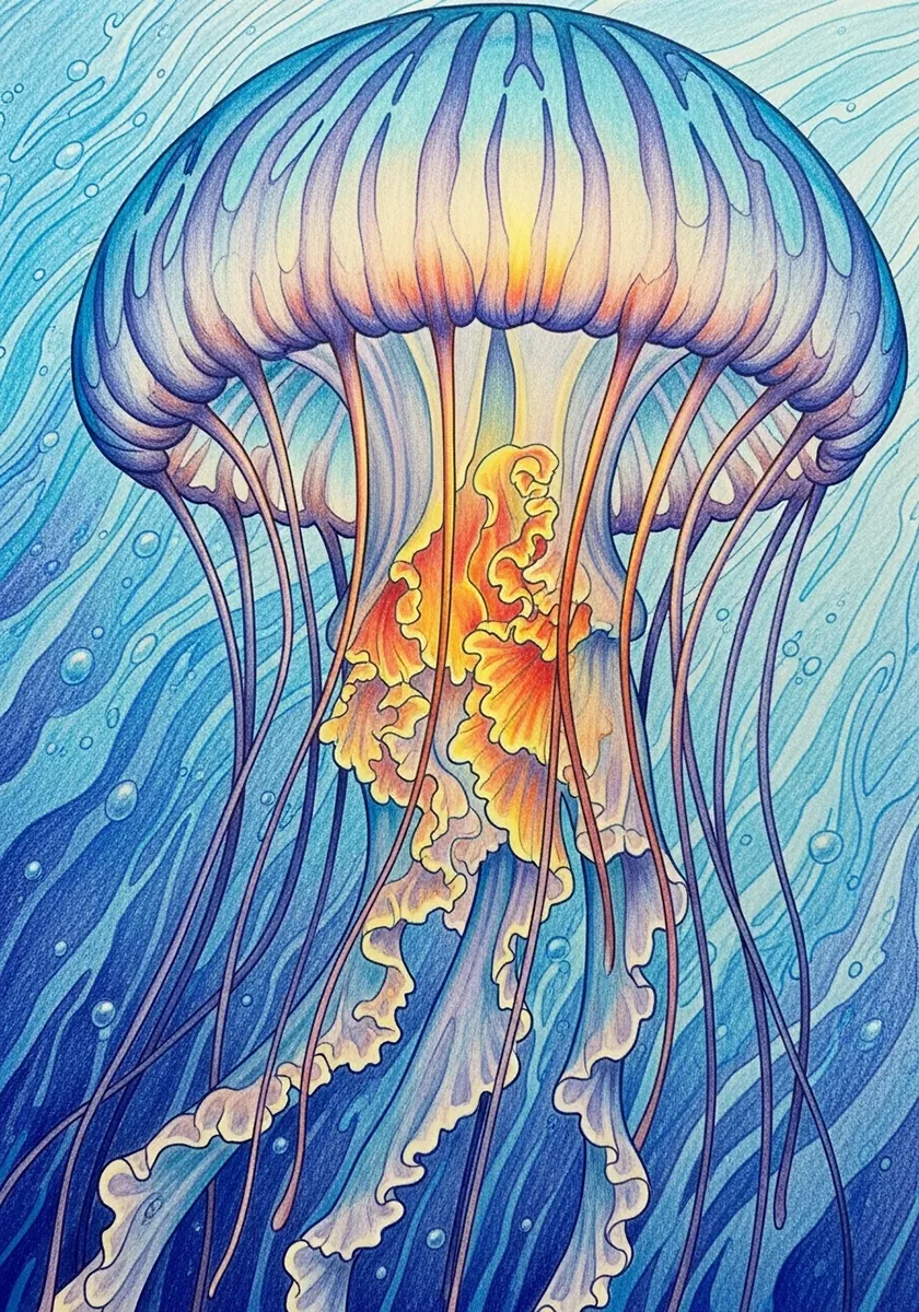
Use warm yellows, vibrant oranges and bold reds. Increase saturation for pop.
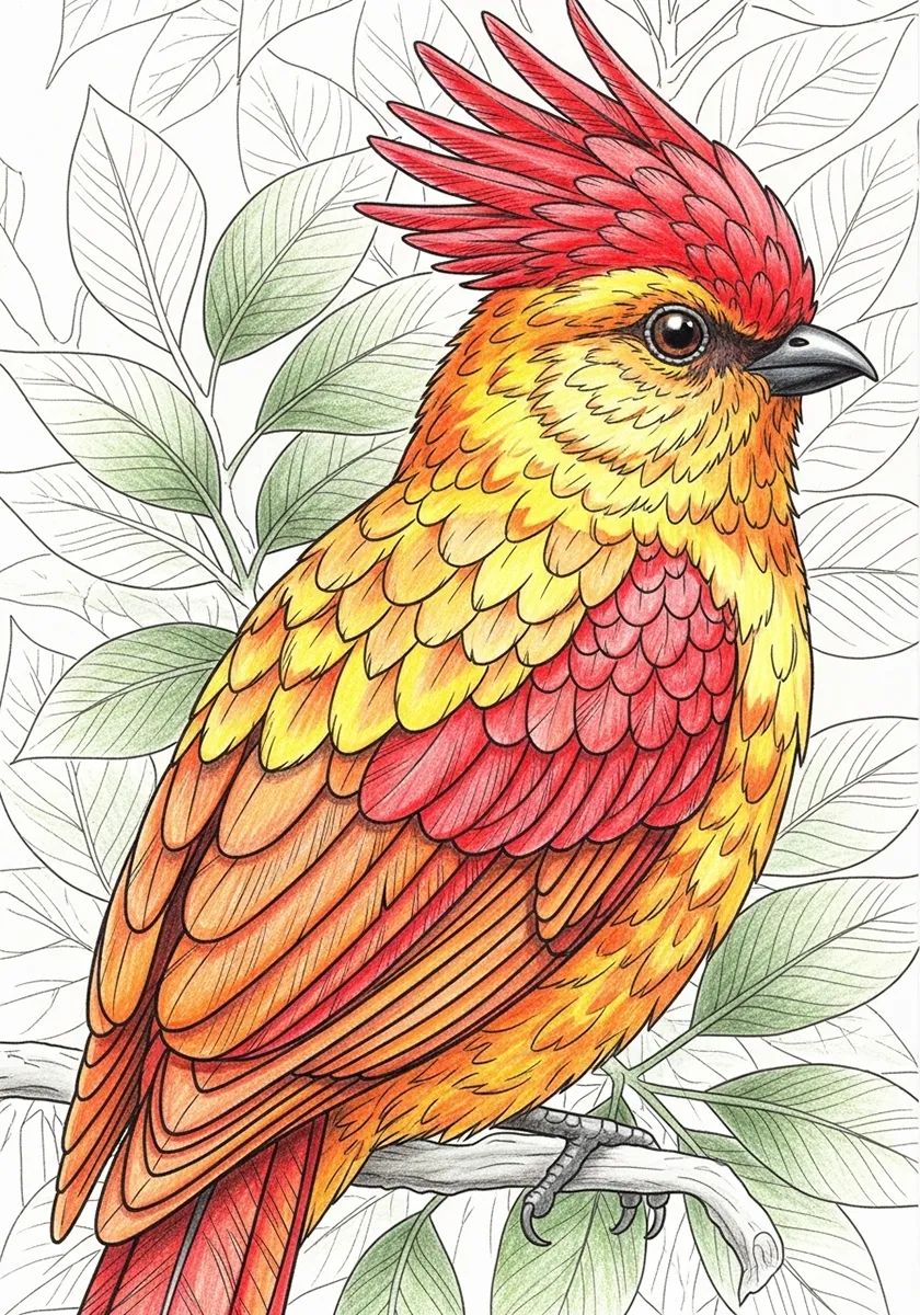
Why it works: Warm hues tend to advance and grab attention. Strong saturation increases arousal and makes focal areas stand out, perfect when you need creative energy.
Try it: Let one colour be the clear hero. Keep two supporting colours slightly less saturated so the hero stays in charge.
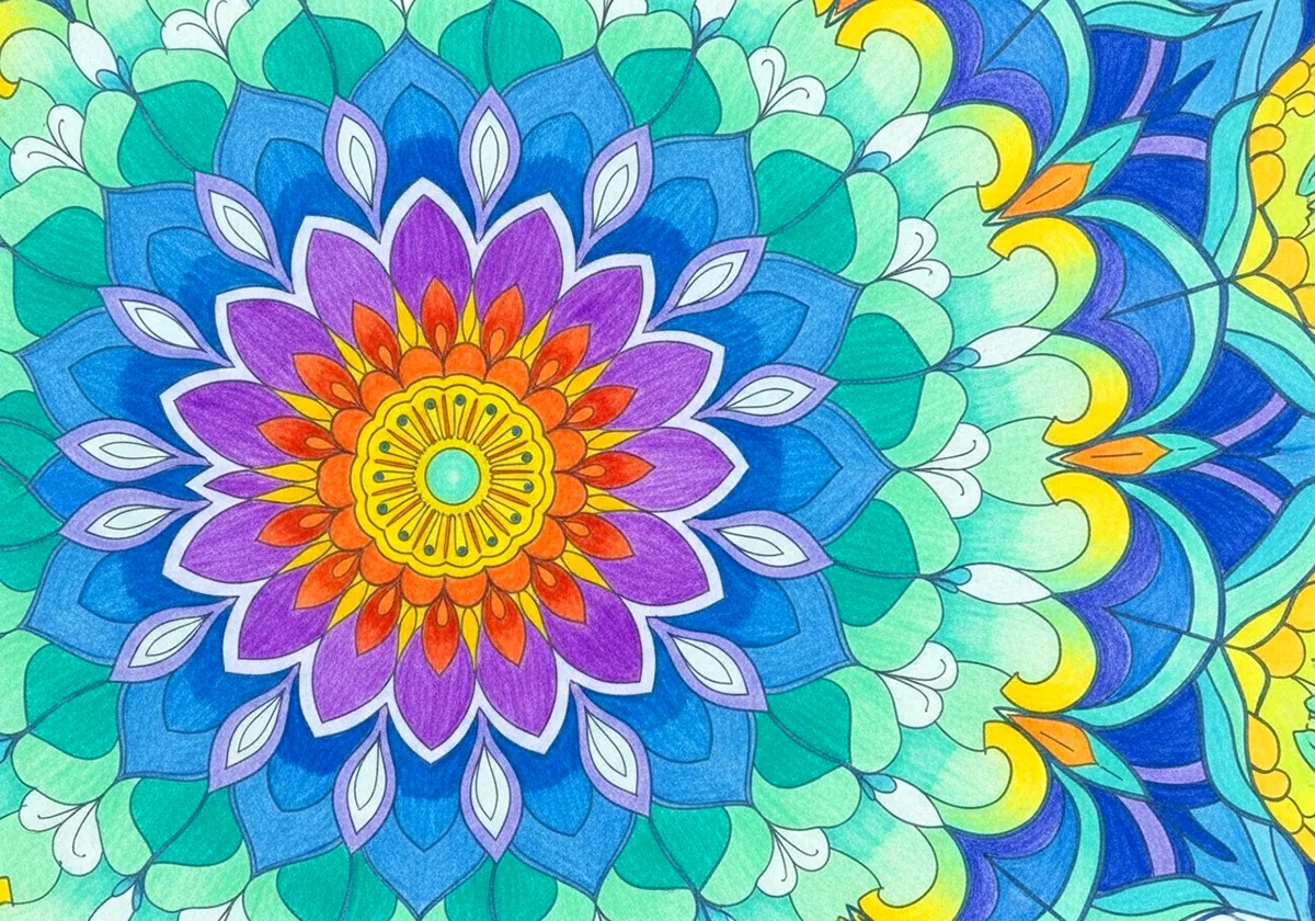
Mix a warm accent with a cool field. Keep the cool area larger and the warm area smaller for a clean focal point.
Why it works: A warm note against cool surroundings creates a clear place for the eye to rest without overwhelming the page, ideal for detailed work requiring concentration.
Try it: Make the warm area physically smaller than the cool field. If the warm note starts to take over, soften its edges with a light cool glaze.
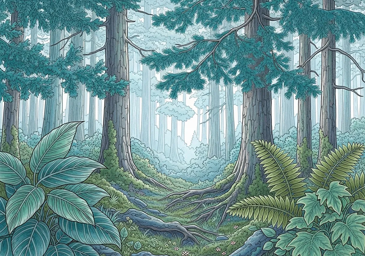
Temperature is a quiet depth cue. Warm edges and accents feel a touch closer. Cool passages feel a touch further away. If you want a subject to sit forward, keep its core colours slightly warmer than the background and give it the stronger value steps. If you want air and space, cool the background and narrow its value range.
Edges matter. A hard warm edge looks crisp and near. A soft cool edge looks distant and calm. You can shift mood without changing the palette by softening edges and compressing values in the background.
Start with the feeling you want. Calm. Bright. Thoughtful. Then pick a small set of pencils that matches that mood. Keep it simple and intentional.
Need help choosing colours for your mood? Use our Mood Colour Selector to generate perfect pencil combinations. Just type in words like “peaceful”, “vibrant”, or “mysterious” and get specific colour recommendations.
If you are unsure, reduce the number of pencils. Three well chosen colours will give you more control than eight similar ones. Paper and light matter too. A bright white paper makes colours look cleaner. A cream paper warms everything slightly.
Before you commit, do a tiny test. On the same paper, lay down three quick rectangles. One for your background, one for your subject, and one for an accent. Aim for the value and saturation you expect to use. Place the rectangles next to each other. Step back. If your eye goes to the wrong place, adjust the value or temperature and try again. This takes less than five minutes and saves time later.
All bold, all the time. If everything is saturated and high contrast, nothing stands out. Fix it by softening most areas and saving bold colour for the focal point.
Ignoring context. A colour can feel different next to different neighbours. Test a swatch beside your main background before you commit.
One note palettes. Even in a calm page, add a tiny warm or brighter note to guide the eye.
Chasing saturation. Vivid pencils look exciting on the page but can flatten form. Fix it by reserving the most saturated layers for small accents and keeping large areas slightly greyed.
Forgetting edges. Everything outlined with the same hard edge makes the page feel busy. Fix it by softening edges in areas you want to recede.
Colour meanings are not universal. Red can read as warning in one place and celebration in another. Indoor light, outdoor light and time of day also shift how we read colour. Trust your eyes. Do a quick swatch on the same paper, in the same light, before you decide.
Pick a page you like. Choose one of the palettes above. Colour only the main subject first and leave the background cool and soft. Step back. If the subject needs more presence, warm a single edge or add a slightly brighter accent.
With a little practice, you will start steering mood on purpose. That is the fun part. You will also notice how much value and saturation change the feeling of the same hue. Once you see it, you can shape it.
Rules are only tools. A cool subject can feel powerful if it owns the strongest value contrast. A warm background can feel calm if it stays light and low contrast. Break one thing at a time and watch how the feeling shifts. That way you learn what created the effect.
Explore more of our colouring books, printable pages, and mindfulness tips to find your inner peace through art.