Colour Theory Techniques
Make any colour pop with complementary colours
By Peace on Paper August 16, 2025
Want to make your colours sing? The secret isn’t better pencils or perfect technique, it’s understanding complementary colours. These are colour pairs that sit opposite each other on the colour wheel and usually create the strongest contrast. When you place red next to green, or blue next to orange, something magical happens: each colour makes the other look more vibrant.
Professional artists have used this trick for centuries to create focal points, add energy, and make colours pop off the page. The best part? You probably already have complementary pairs in your pencil set without realising it.
Complementary colours work because of how our eyes process light. When you look at red, your eyes create an afterimage of green. When these colours appear together, they reinforce each other, creating strong visual impact and a subtle vibration at their edges.
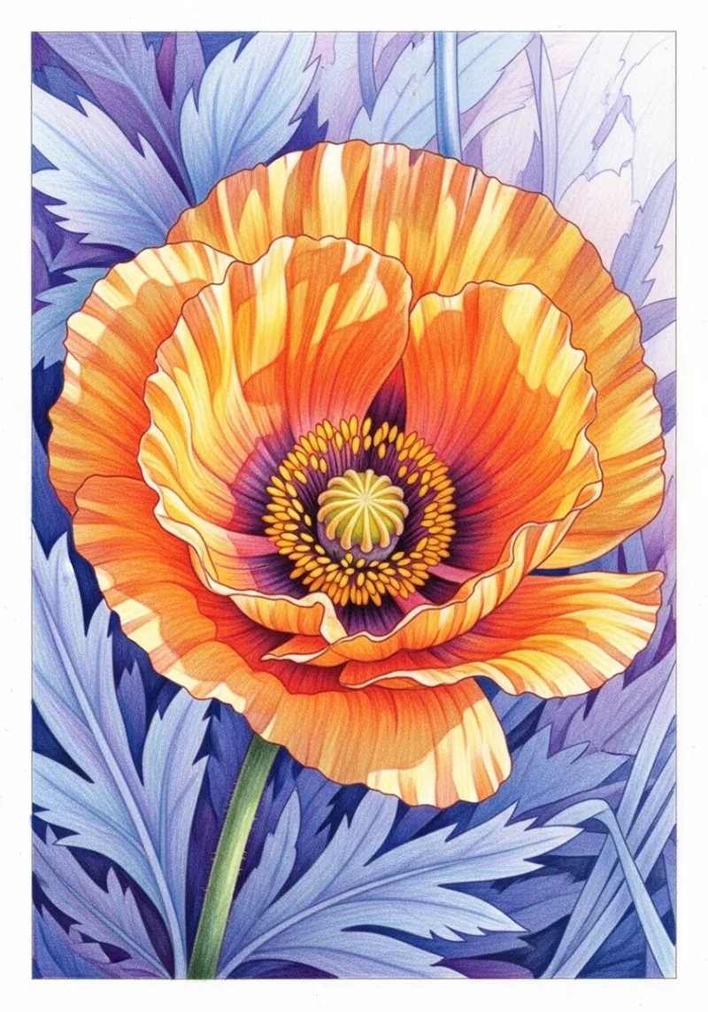
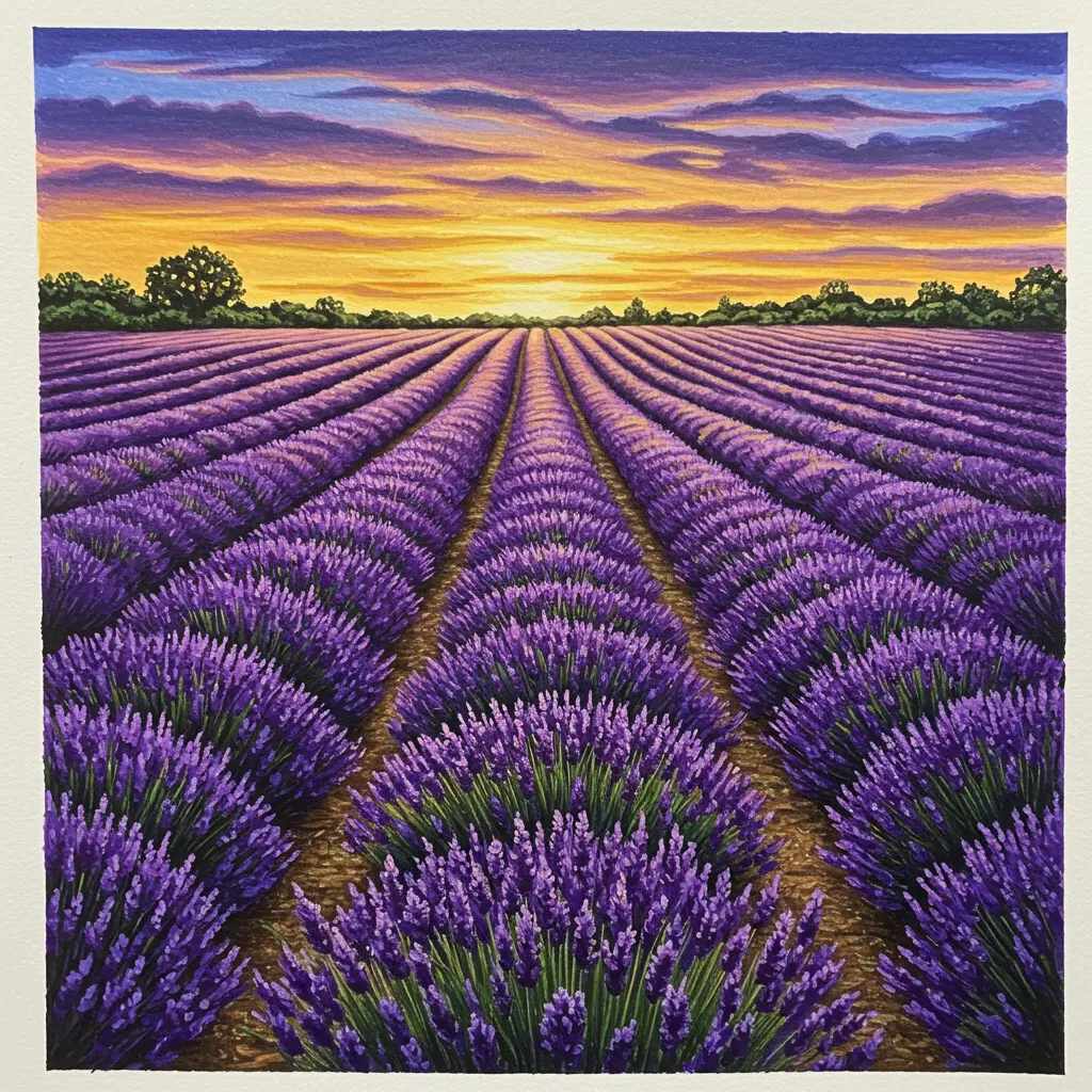
Think of a red poppy in a green field, or orange autumn leaves against a blue sky. These combinations feel naturally striking because they’re complementary pairs working together.
Want perfect complementary pairs instantly? Try our colour scheme generator. Select any starting colour and it will show you its complement, plus harmonious schemes to build your palette.
Here are the primary complementary pairs that will transform your colouring. Master these, and you’ll rarely struggle to make colours pop again:
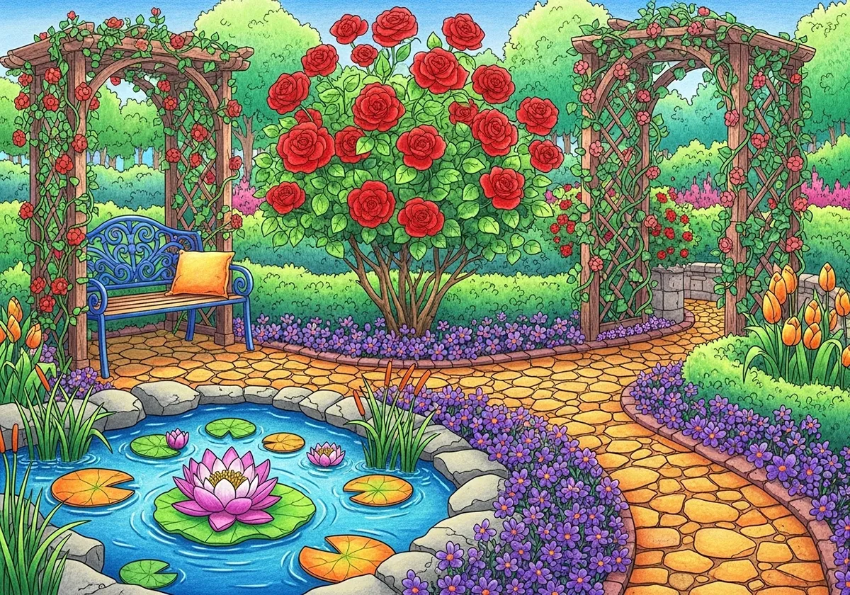
The Classic Energy Pair Red advances powerfully while green provides calm balance. Perfect for flowers, festive scenes, or any time you want warm energy against cool stability.
Try this: Use vibrant red for flower centres with sage green leaves, or emerald green backgrounds with crimson accents.
The Sunset Combination Cool blue recedes while warm orange jumps forward. This pair creates natural depth and warmth, ideal for skies, water scenes, or cosy indoor settings.
Try this: Orange candlelight against deep blue evening shadows, or coral flowers on navy backgrounds.
The Royal Drama Pair Bright yellow creates instant sunshine while purple adds sophisticated depth. This high-contrast pair works beautifully for dramatic lighting effects.
Try this: Golden sunlight streaming through purple shadows, or lavender fields with bright yellow highlights.
Yellow‑green and red‑purple: Softer than the primaries but still dynamic
Blue‑green and red‑orange: Perfect for natural scenes with gentle contrast
Blue‑purple and yellow‑orange: Elegant combination for sophisticated palettes
Use one colour as your main palette, then add tiny touches of its complement for instant pop.
How: If you’re colouring with blues, add small orange details (a button, flower centres, warm highlights). Keep the complement to about 10 per cent of your total colour area.
Perfect for: Beginners who want impact without overwhelming colour schemes.
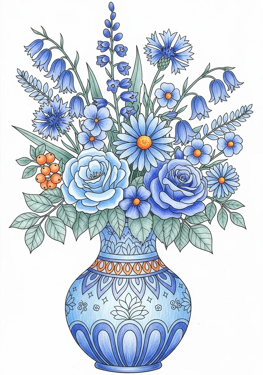
Accent method example: Small orange accents (about 10%) make this blue vase pop without overwhelming the design.
Use equal amounts of both complements, but in different areas to create clear focal points.
How: Make your main subject one colour and the background its complement. This creates natural depth and draws the eye exactly where you want it.
Perfect for: Creating strong focal points in busy scenes.

Split focus method: The red poppy claims the foreground while green grass creates a receding background.
Place pure complementary colours directly next to each other for maximum optical impact.
How: Use this sparingly, where edges meet between complementary areas. The contrast will make both colours appear more saturated and create visual energy.
Perfect for: Adding drama to key details like eyes, flower edges, or architectural features.
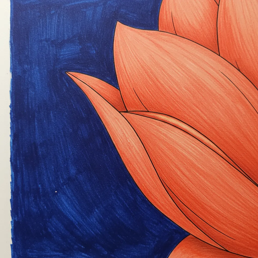
Vibrating edge technique: Pure complements touching creates optical energy—use sparingly at key edges.
Use toned-down versions of complements for sophisticated, professional-looking results.
How: Mix a tiny bit of each complement into the other. This creates harmonious greys and earth tones while maintaining the relationship.
Perfect for: Realistic colouring, sophisticated palettes, and avoiding overly bright results.
Muted harmony method: Adding a touch of orange to the blue (and blue to the orange) creates sophisticated, natural-looking greys and earth tones.
Use complements to enhance warm/cool temperature effects you learned in previous techniques.
How: Place warm complements (red-orange) in light areas and cool complements (blue-green) in shadow areas for natural-looking dimension.
Perfect for: Realistic lighting and creating convincing three‑dimensional form.
Temperature bridge method: Warm yellow light and cool purple shadows use complements to enhance form.
Mistake 1: Using too much of both Equal amounts of strong complements can fight for attention and tire the eyes. Quick fix: Use the 70/30 rule: one complement dominates, the other accents.
Mistake 1 example: Equal amounts of strong complements create visual tension and tire the eyes.
Mistake 2: Placing pure complements everywhere Vibrating edges throughout your artwork create visual chaos. Quick fix: Save pure complementary contrast for your main focal point only.
Mistake 2 example: Pure complements used everywhere create overwhelming visual chaos.
Mistake 3: Ignoring value relationships Complementary colours of the same lightness can look flat despite the hue contrast. Quick fix: Make one complement lighter and one darker for better depth.

Mistake 3 example: Same-value complements look flat despite strong hue contrast.
Mistake 4: Forgetting context Complementary pairs behave differently next to other colours. Quick fix: Test your combination on scrap paper in the context of your other colours first.
You don’t need hundreds of pencils. These essential pairs give you maximum complementary power:
Basic Starter Set:
Expanded Professional Set:
Find your perfect colours: Use our colour scheme generator to see exactly which pencils from your collection work as complementary pairs. Input any colour you own and discover its complement.
5‑minute complementary test: Pick one small area on your current page. Choose any colour you like, then find its complement using the colour wheel or our generator tool. Add just a tiny accent of the complement (a single leaf, button, or highlight). Notice how both colours suddenly look more vibrant.
The swatch test: On scrap paper, colour two small squares of any complementary pair. Place them side by side, then separate them. See how they look stronger together than apart? That’s complementary magic at work.
Once you’re comfortable with basic complements, try these professional tricks:
Near‑complements: Use colours almost opposite (like red with blue‑green instead of pure green) for sophisticated harmony with less intensity.
Temperature shifts: Warm up one complement and cool down the other to enhance their natural temperature differences.
Broken colour: Instead of solid areas, mix tiny strokes of complements to create optical mixing and shimmer effects.
Need more complex schemes? Our colour scheme generator includes split‑complementary and triadic options that build on complementary relationships for sophisticated palettes.
Start simple. Pick just one complementary pair from the six essentials above. Use it with the accent method, let one colour dominate your page, then add small touches of its complement where you want the eye to go.
Don’t overthink it. The relationship between complementary colours is so strong that even a rough approximation will create more impact than most other combinations. Once you see how this one simple principle transforms your work, you’ll start noticing complementary relationships everywhere, and your colouring will stop looking flat.
The secret to making any colour pop isn’t mystery or magic. It’s understanding that every colour has a partner that makes it shine. Find those partners, and you’ll have the key to vibrant, professional‑looking artwork every time.
Explore more of our colouring books, printable pages, and mindfulness tips to find your inner peace through art.