Colour Theory Techniques
Stop Flat Colouring: 5 Warm vs Cool Tricks for Professional Results
By Peace on Paper August 14, 2024
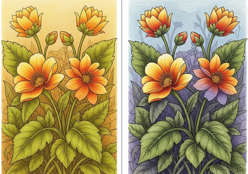
Does your colouring look flat and lifeless? The secret professional artists know is simple: warm and cool colour temperature. Think about why a cosy orange candle feels different from a crisp blue winter sky—that’s colour temperature at work, and you can use it to transform your artwork instantly.
Here are 5 simple warm vs cool tricks that will add depth, mood, and professional polish to your colouring. Each technique uses colours you probably already have and can be applied to any project right away.
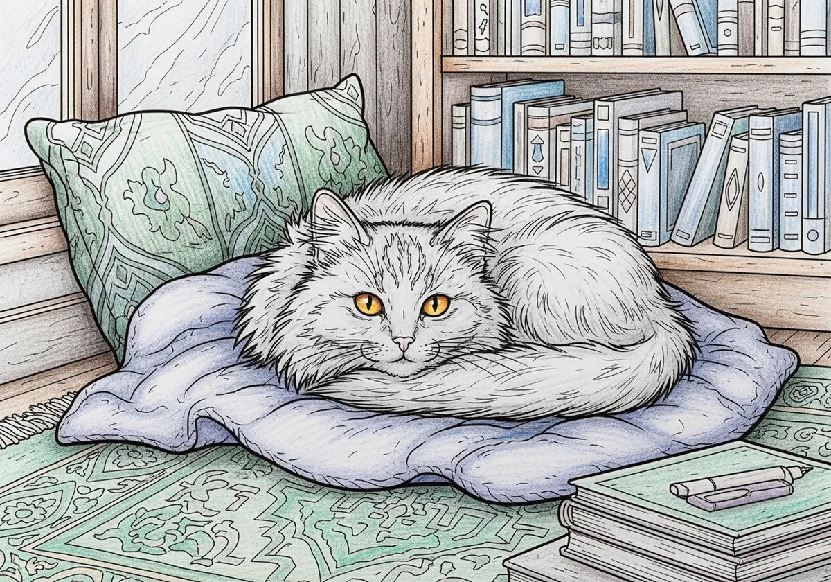
Most flat colouring happens because everything is the same “temperature”. When all your colours lean the same way—all warm or all cool—nothing advances or recedes. Professional-looking art uses the contrast between warm colours (reds, oranges, yellows) and cool colours (blues, greens, purples) to create natural depth and focus.
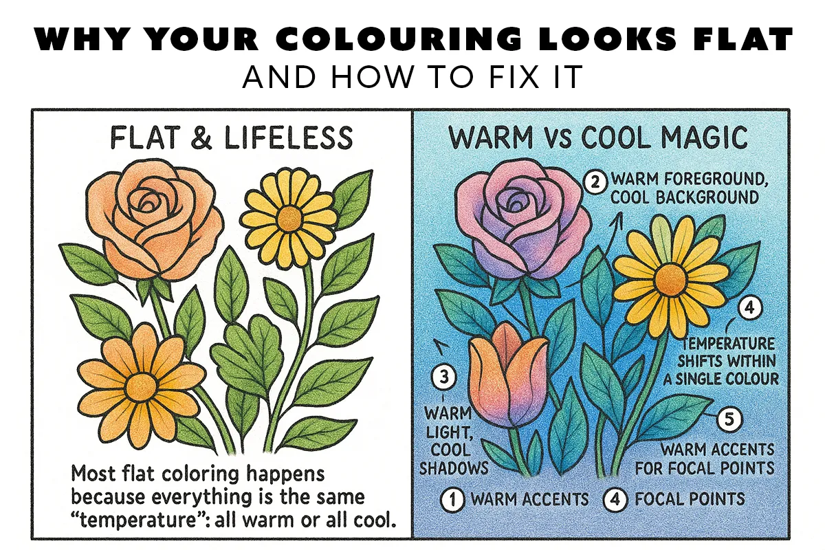

The Problem: Your artwork looks flat with no sense of distance.
The Solution: Use warm colours for things you want to appear close and cool colours for things you want to recede.
How to Apply: For any scene, colour your main subject with slightly warmer versions of your chosen colours. Push your background towards cooler versions. Even a subtle shift works—try mixing a tiny bit of yellow into foreground colours and a tiny bit of blue into background colours.
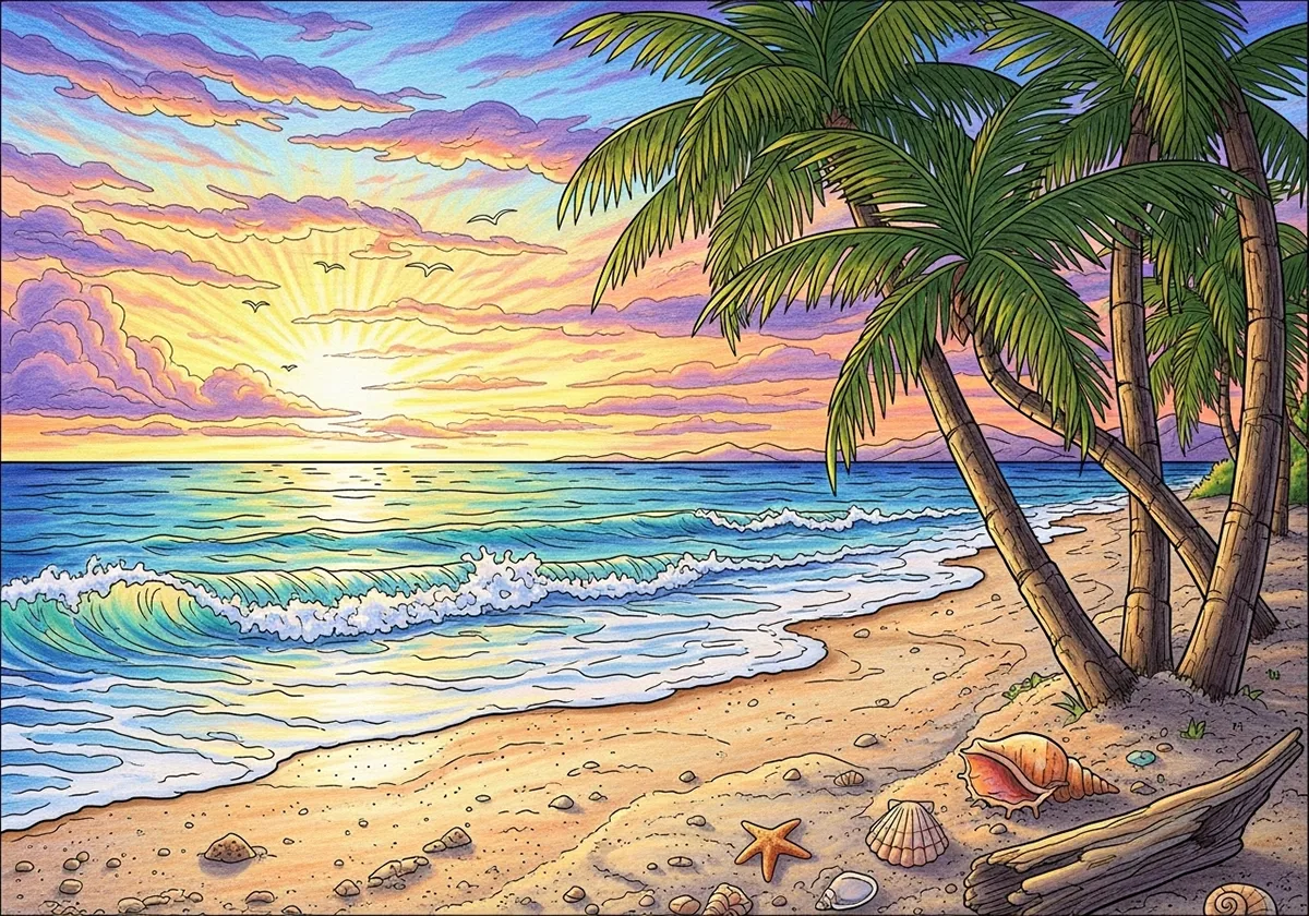
The Problem: Your lighting looks artificial or muddy.
The Solution: Most natural light is warm (sun, candles, fire), so highlights should lean warm while shadows lean cool.
How to Apply: When shading, add a hint of warm yellow or orange to your highlight areas. For shadows, mix in a touch of blue or purple. This mimics how light actually behaves and makes your colouring look more realistic.
The Problem: Nothing in your artwork grabs attention.
The Solution: Place a warm accent against a cool field (or vice versa) to create an instant focal point.
How to Apply: If your overall palette is cool, add one small warm element where you want the eye to go. If your palette is warm, add a small cool accent. This works for flowers in a landscape, buttons on clothing, or eyes in a portrait.
The Problem: Your colours don’t feel cohesive or create the right mood.
The Solution: Every colour has warm and cool versions—choose based on the feeling you want.
How to Apply:

The Problem: Your colour changes look abrupt and amateur.
The Solution: Create smooth temperature transitions across forms and areas.
How to Apply: Gradually shift from warm to cool across rounded objects, skies, or large areas. Start warm where light hits, gradually cool down as forms turn away. This creates the subtle colour variation that makes professional artwork look so polished.
Quick Temperature Test: Pick just one small element on your current page—a flower, leaf, or simple shape. Try Trick 1 by making it a warmer colour, then add a cooler shadow or background area nearby. See how this tiny temperature change creates instant depth.
Sort Your Pencils: Take 5 minutes to sort any questionable pencils by placing them next to a known warm (like orange) and a known cool (like blue). Which direction do they lean? Now you know which team they’re on for future projects.
Mistake 1: All One Temperature - Everything warm or all cool creates flat, lifeless colouring. Quick Fix: Add just one small accent from the opposite temperature family.
Mistake 2: Muddy Mixes - Crossing warm and cool accidentally creates muddy colours. Quick Fix: Keep warm with warm and cool with cool when blending. Only mix temperatures intentionally.
Mistake 3: Inconsistent Light - Mixing warm and cool light sources confuses the eye. Quick Fix: Decide if your light is warm (sunset, candle) or cool (overcast day) and stick with it throughout.
You don’t need hundreds of pencils. These pairs give you warm/cool options in every colour family:
Reds: Cadmium Red (warm) + Crimson Red (cool)
Blues: Ultramarine (warm) + Prussian Blue (cool)
Yellows: Cadmium Yellow (warm) + Lemon Yellow (cool)
Greens: Sap Green (warm) + Viridian (cool)
With just 8 pencils, you can control temperature in any project and avoid flat colouring forever.
Pick one trick from the 5 above. Use it on your next page. Don’t try to master everything at once—just focus on that one temperature principle. Notice how it changes the feel of your artwork, then build from there.
Professional-looking colouring isn’t about expensive supplies or perfect technique. It’s about understanding how warm and cool work together to create depth, mood, and visual interest. Master these 5 tricks, and you’ll never struggle with flat colouring again.
Explore more of our colouring books, printable pages, and mindfulness tips to find your inner peace through art.